The page navigation is complete. You may now navigate the page content as you wish.
Skip to main content

Advanced Table

Used to display complex, structured tabular data with advanced features.

The Advanced Table is designed for complex datasets, featuring sticky headers, keyboard navigation, and expandable rows. The Table and Advanced Table features aren't interchangeable.

Usage

When to use

  • For large data sets with many properties that benefit from being viewed in a scrollable container.
  • When expandable rows are needed for hierarchical data.
  • When users would benefit from more efficient keyboard navigation, e.g., when there are many rows or columns.
  • When users would benefit from customizing the view of the data set (column width, order, etc).

When not to use

  • If your dataset requires only basic interactions, such as simple sorting or pagination, and does not require features like nested rows, advanced keyboard navigation, or sticky headers, the standard Table is a more suitable choice.
  • When data visualizations better convey the data.
  • As a layout mechanism for structuring content that isn’t tabular data.
  • To replicate spreadsheet-like functionality with extensive in-cell editing or calculations.

Columns

Sorting

Unsupported feature

Sorting is not supported for nested rows at this time.

  • While multiple columns may offer sorting, only one column can be sorted at a time.
  • In addition to standard sorting methods (like alphabetical or chronological), domain-specific sorting, such as by status severity, can also be useful.
  • Sorting is not relevant for all content and should be applied thoughtfully.

Tooltips

Labels should be concise and straightforward. If more context is necessary, a Tooltip can be used in conjunction with the label, but should be used sparingly and as a last resort.

Some examples where it may be useful to include additional context in a tooltip include:

  • When the label contains a product or HashiCorp-specific term.
  • When the label refers to a setting that can be changed elsewhere in the application.

Width

Column width is determined by manually resizing the header column and cells within Figma. As a best practice, column width should be adjusted to fit the longest data type within the cell.

Placement

Differences between Figma and code

The column placement property is only relevant within Figma and doesn’t exist as a property in code.

Column placement determines the visual styling based on where the column is within the table structure.
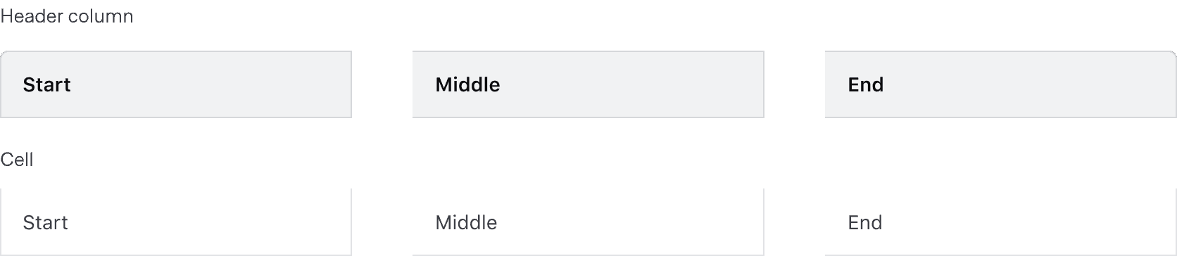
For header columns, start placement adds a border radius to the top left corner and a border on the left and right, middle placement has squared corners and a border on the right, end placement has a border radius on the top right corner and a border on the right. For cells, start placement has a border on the left and right, middle and end placement have a border on the right.

Alignment

The content's alignment can impact readability and scannability. The proper alignment method depends on the content type and its relative position in the table.

Do

Use consistent alignment between the header label and the cell content in a column.

Don’t

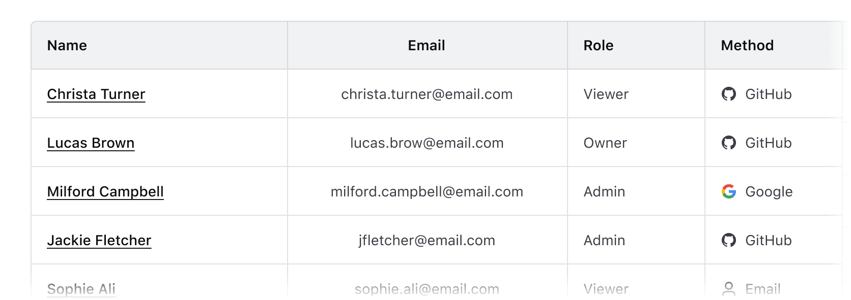
Avoid misaligned header labels and content.

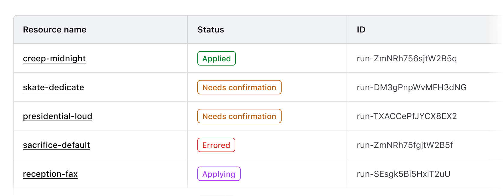
Left alignment

By default, align content to the left. This lends itself to the default left-to-right reading order of most content types.

Use left alignment for:

  • Strings (unique identifiers or IDs, names and naming conventions, etc).
  • Numerical values that do not contain decimals or floating point numbers.
  • Numerical values that contain periods or other delimiter characters (IP addresses).
  • Nested components that display a string, e.g., a Badge.
Right alignment

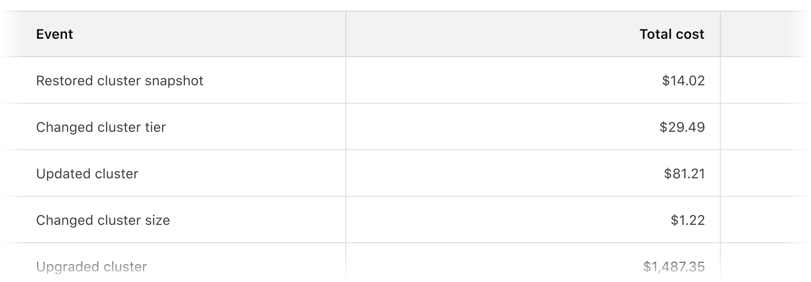
Right alignment can be used when expressing numerical values with decimals as this aligns the decimal places vertically.

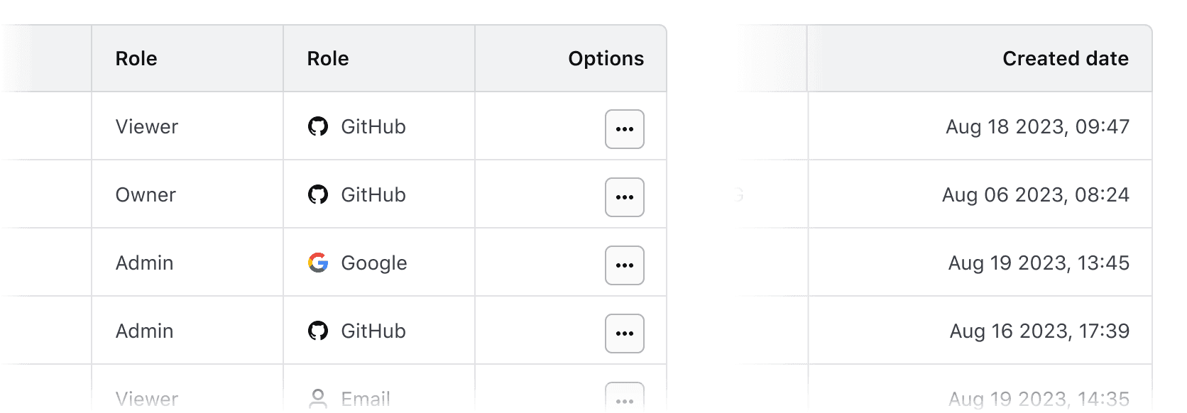
Common examples of right alignment include:

  • Financial information, currency amounts, or other numbers with decimal values.
  • In a column with a "more options" function.
  • As a means to visually "bookend" the row with content that is of a similar length, e.g., timestamps, TTL (time-to-live) values, dates.
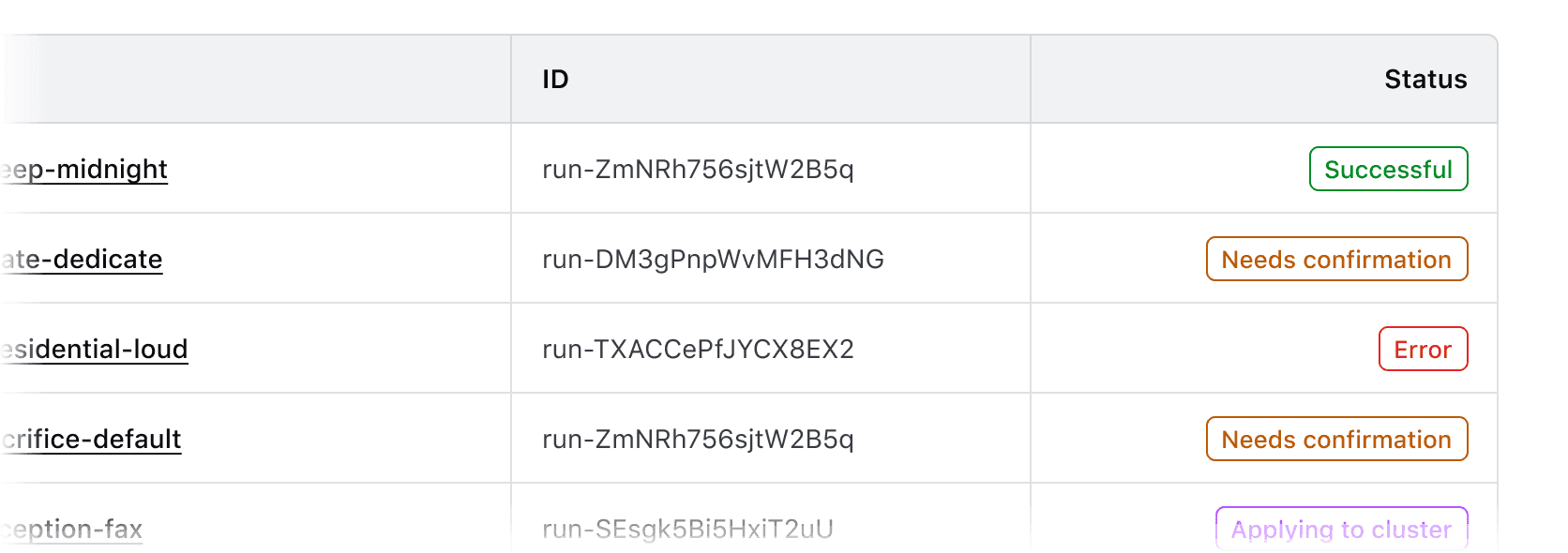
Don’t

Don’t align content of varied lengths to the right. This can make it difficult to read by forcing an unnatural reading pattern.
Other alignment methods

We don’t recommend centered or justified content alignment. These can be difficult to read, especially when the content varies in length.

Don’t

Don’t center header labels or cell content within a table.
Reordering columns

If hasReorderableColumns is enabled on the Ember component, users can reorder columns either by clicking and dragging on the column reorder handle with a mouse, or by moving focus to the handle with a keyboard and using the right and left arrow keys.
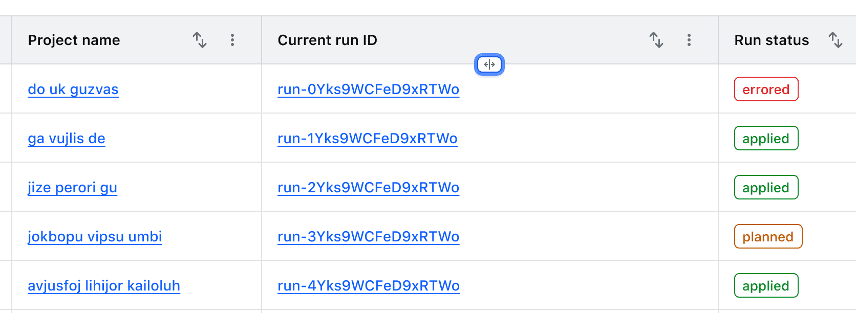
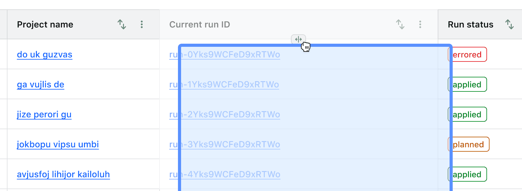
While these properties aren't available in the Figma component, examples are available to copy and paste into design files.

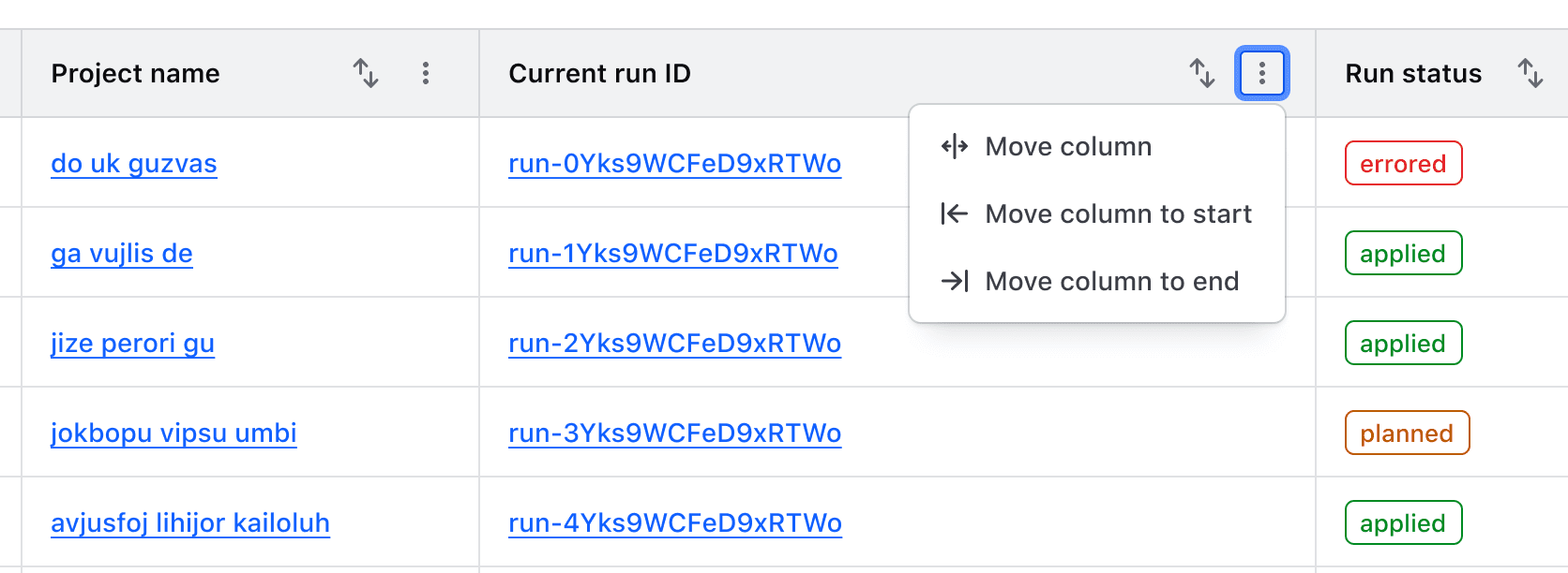
Actions related to moving columns are displayed in a context menu in the table header. These are not customizable and include:

  • Move column: moves focus to the reordering handle
  • Move column to start/end: moves the column to the first or last position in the table unless the column is already in this position.
Resizing columns

Columns can be resized by dragging the "resize border" with a mouse or by moving focus to it and using the left and right arrow keys.

While these properties aren't available in the Figma component, examples are available to copy and paste into design files and the Resize Border is available to use as a starting point for expressing this interaction.

The Figma component does not support this resizing feature. Instead, we publish a Resize Border component and Templates to use as a starting point for expressing this interaction. We also provide examples that you can copy and paste into your design files.
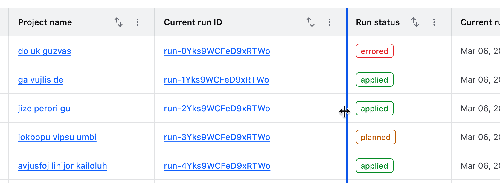
The interactive resize border in its active state being dragged with a mouse

When resizable columns are enabled, actions related to each function are rendered in a context menu in the table header. These functions are not customizable.
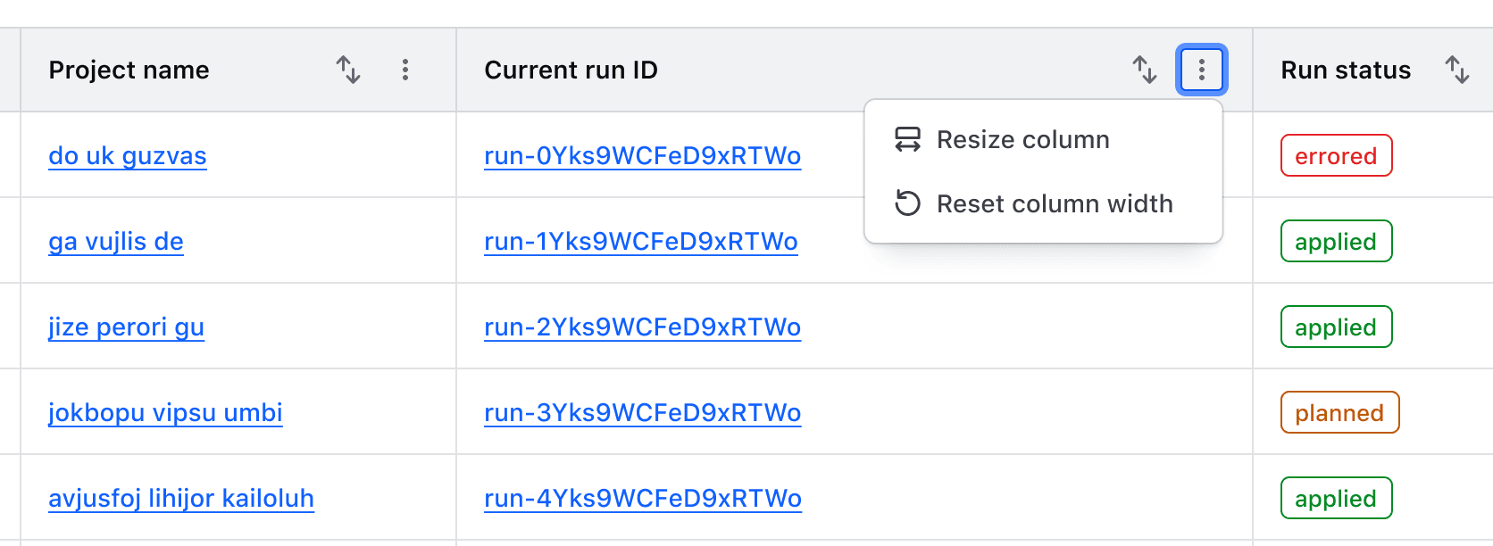
An open context menu in the Advanced Table displays two options; resize column, and reset column width

Minimum and maximum width

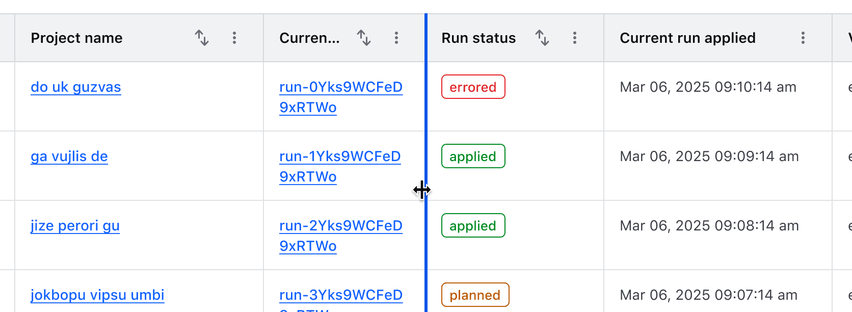
To prevent a column from being resized beyond a reasonable amount, we enforce a default minimum width of 150px and a maximum width of 800px. These can be overridden via the component API if necessary.
Column and row span

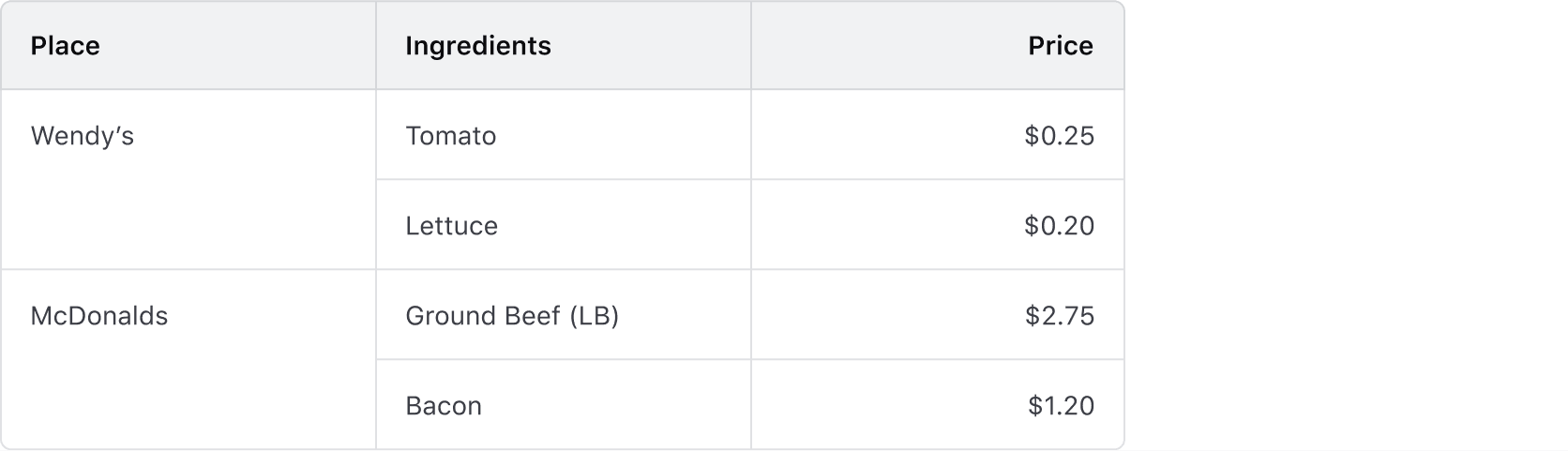
  • Supports combining multiple columns or rows into a single cell.
  • Apply column and row spans carefully to maintain alignment, accessibility, and smooth table interactions.
  • Multi-span cells should use the same alignment for readability.
Rows

Headers

  • Labels in headers should be concise and straightforward.
  • The label should clearly indicate what type of content is contained within the cell (string, number, status, etc).
  • Labels should always use sentence-case.

Expandable rows

Expandable rows let users show or hide more content without navigating away from the table. The expanded content should align with the header labels, even if the parent row includes minimal data.
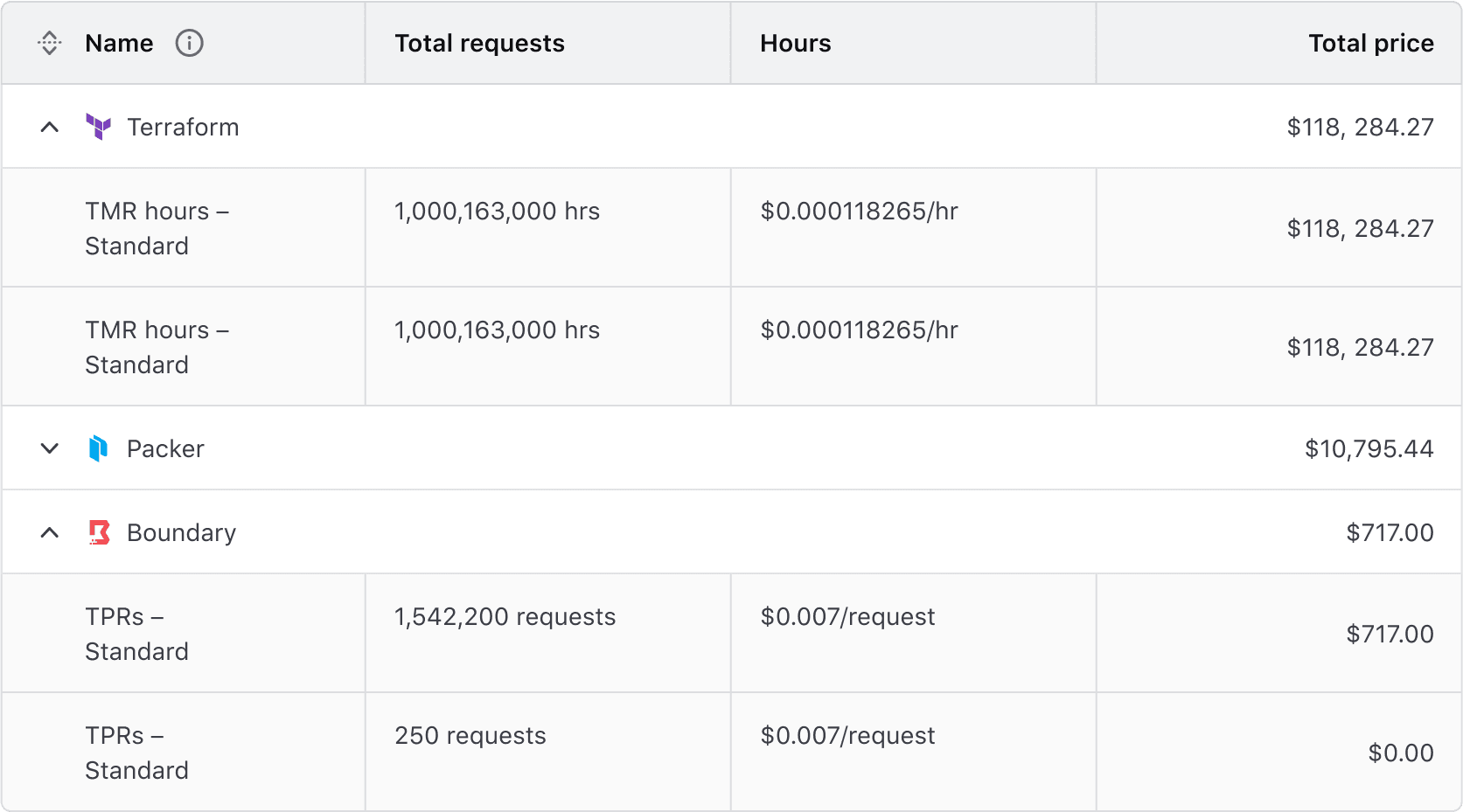
Don’t

Avoid using expandable rows when data is not structured in parent-child relationships.
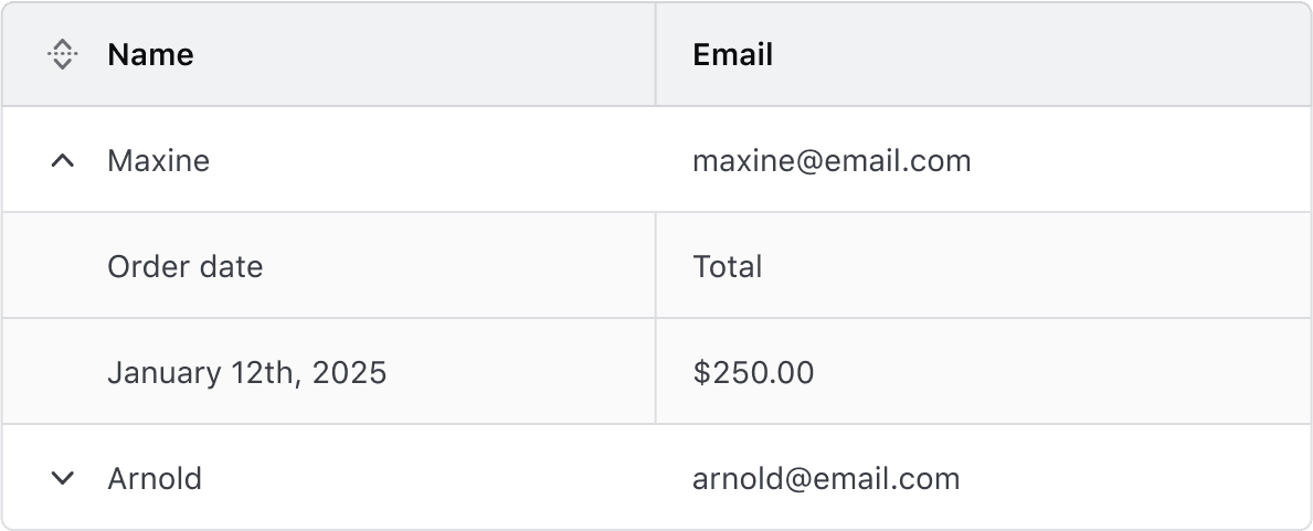
Advanced Table where the parent row has cells for name and email, but children rows have cells containing order date and total.

Don’t

Avoid using different density settings for parent and child rows.
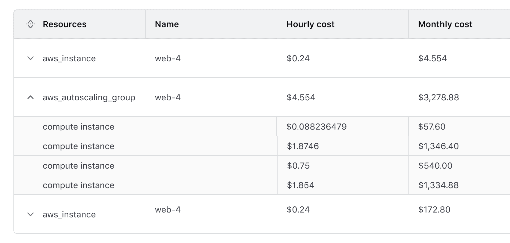
Advanced Table with default height parent rows and short density nested rows is something to avoid

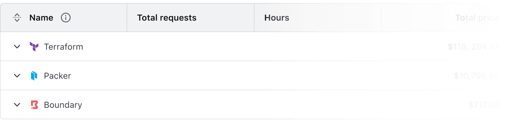
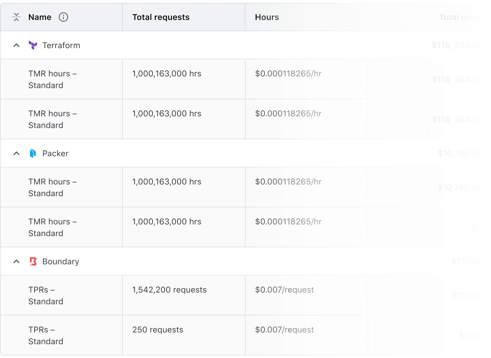
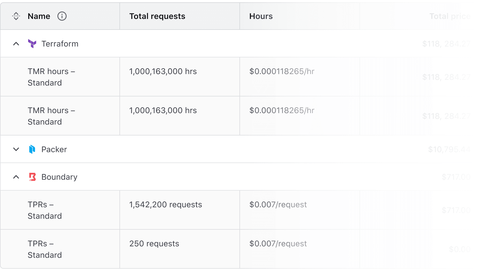
Expand/Collapse All Button

The Expand/Collapse All button allows users to expand or collapse all rows, including nested rows. It provides quick access to more content but may impact readability when content is long or detailed.

Interactions

Default state

The Advanced Table supports any combination of expanded or collapsed rows on load. The button reflects the initial state.


The “Expand All” button displays if any rows are currently collapsed

“Collapse All” button displays if all rows are expanded.

Collapsed state

Interacting with the “Expand All” button expands all rows, including nested rows.

Expanded state

Once all rows are expanded, the “Collapse All” button is displayed.

Mixed state

If some rows are expanded and others are collapsed, the “Expand All” button will persist until all rows are expanded.

Striping

Accessibility alert

Ensure that content within striped rows maintains adequate color contrast with the striped background.

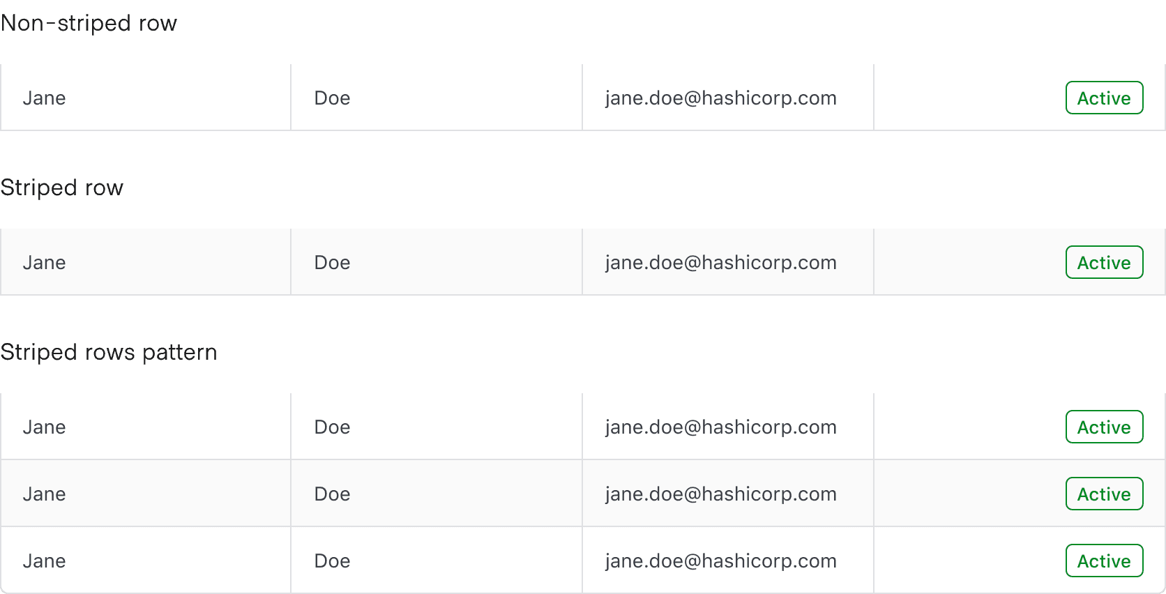
Striping enhances readability by alternating row colors, making it easier to scan tabular data.

  • Non-Nested Advanced Tables: Striping starts with the second row, distinguishing it from the header.
  • Nested Advanced Tables: Child rows are automatically striped, while parent rows remain unstriped to visually reinforce hierarchy. This behavior cannot be disabled.
Placement

Differences between Figma and code

The row placement property is only relevant within Figma and doesn’t exist as a property within the code.

The rowPlacement property determines the border radius of a cell. It is only available on cells where the colPlacement property is set to start or end.

Cells

For the user to scan, sort, and filter the table easily, each cell should contain a single piece of data. Having more than one piece of data in a cell makes it harder for users to navigate the relationships between headers and cells.

Density

  • By default, use the medium density for balance and readability.
  • To fit more rows on a page, use the short density. Use this only for text-heavy tables, as it can make them harder to scan.
  • For a smaller dataset, e.g., basic user data, consider using the tall density to provide the content with more breathing room.

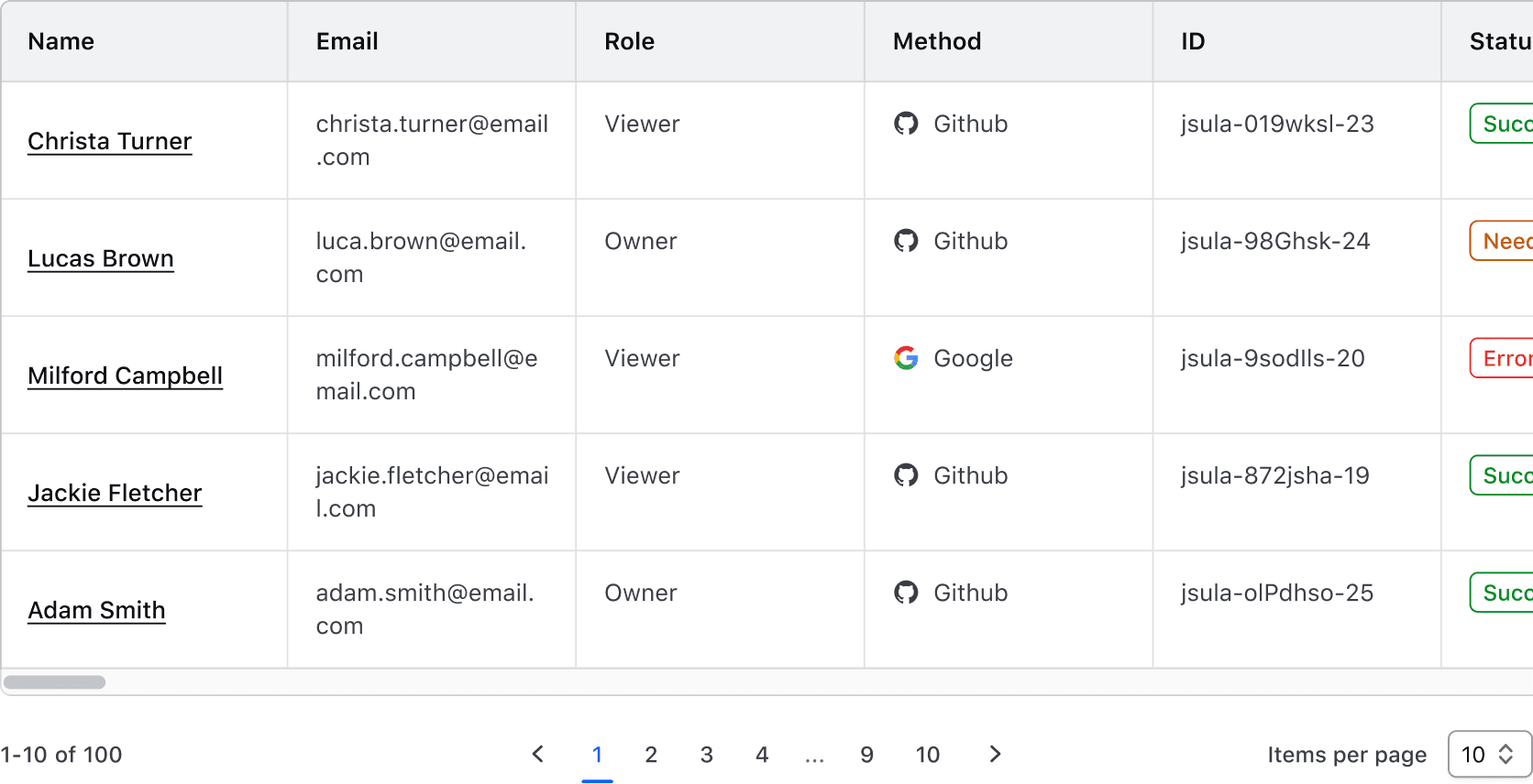
Horizontal scrolling

Use horizontal scrolling when the number of columns expands beyond the viewport or container.
Sticky headers and columns

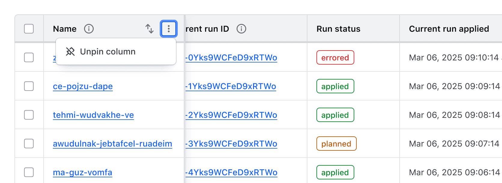
The header and first column can be pinned, helping users navigate large datasets while persisting key values, such as names or IDs.

There are a few things to consider when implementing a sticky header or column:

  • Instances of the Advanced Table with nested rows, expandable rows, and colSpan or rowSpan do not support a sticky column because what classifies as the first column is variable depending on these properties.
  • Setting the first column as sticky in a table with multi-selection will couple the multi-select column and the first column of data together.

If hasStickyFirstColumn is set to true or false in the Ember component, a control will be exposed in the context menu allowing users to "Pin" and "Unpin" the first column in the Advanced Table.
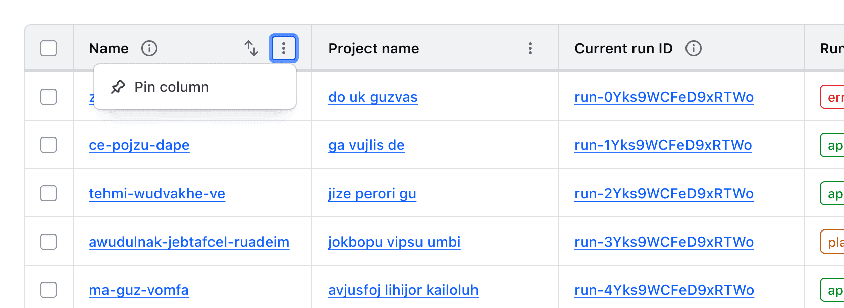
With the sticky column option set, the Advanced Table will have a context menu in the column header cell with a single option to pin column

Once pinned, the same context menu in the column header cell will then contain single "Unpin column" option

Multi-Select

Unsupported feature

Multi-select is not supported for nested rows at this time.

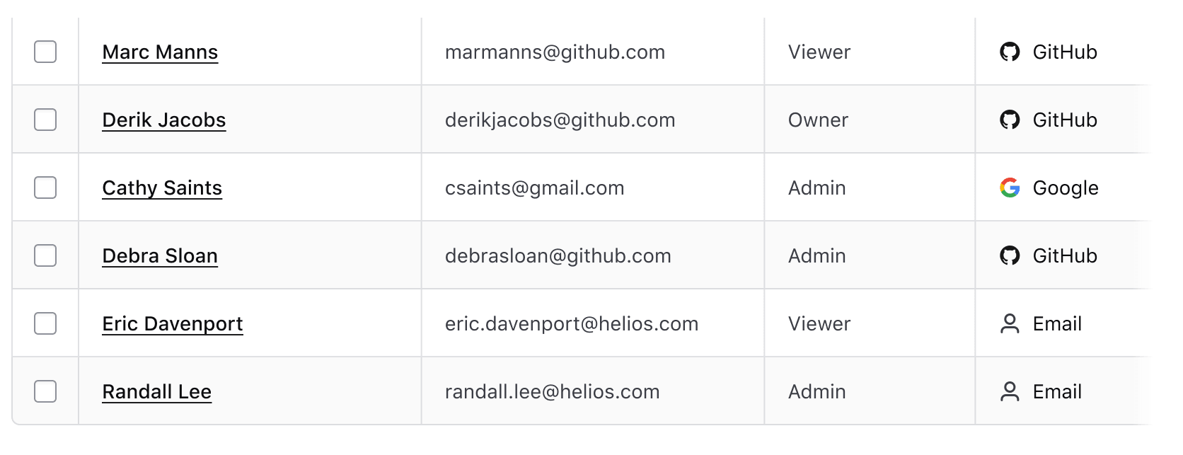
Multi-select allows users to select multiple rows to perform bulk actions, such as deleting or exporting data. Selection states are maintained across pagination and filtering.

A multi-select pattern consists of:

A "Select all" checkbox is used in the header row to allow the simultaneous selection or deselection of all child rows.

Individual checkboxes added to each row allow for the selection of that row.
For more details, see the Multi-Select Table Pattern.

Empty state

The Advanced Table supports displaying an empty state using the Application State component to display an informative message and prompt user action. There are several reasons an empty state may occur: the data set is empty, the applied filters return no results, etc.
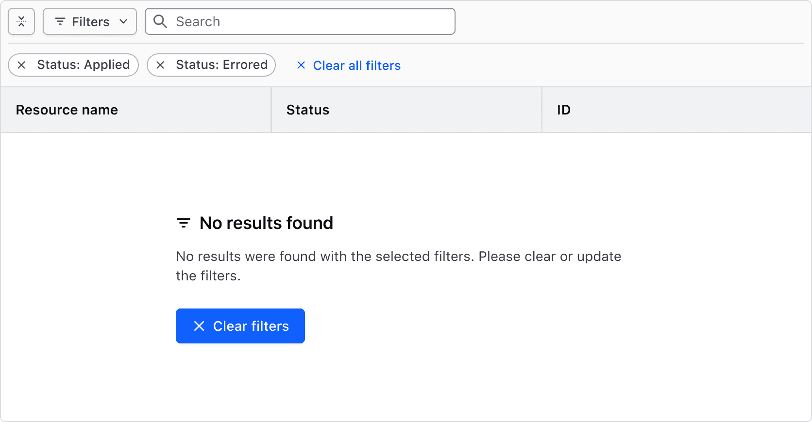
Displaying the empty state in the Ember component is handled automatically when the data model contains no entries. In Figma we provide a template component that can be inserted in a design, while also including it in the Advanced Table template components.

How to use this component

The Advanced Table is a component meant to display tabular data to overcome limitations with the HTML <table> elements and increase the accessibility for complex features, like nested rows and a sticky header.

Instead of using the <table> elements, the Advanced Table uses <div>s with explicitly set roles (for example, instead of <tr>, it uses <div role="row">). This allows the Advanced Table to use CSS Grid for styling.

Basic Advanced Table

Consumer responsibility

For documentation purposes, we’re importing the data from an internal file and working with that as data model. Depending on your context and needs, you may want to manipulate and adapt the structure of your data to better suit your needs in the template code.

To use an Advanced Table, you will need to:

  • pass the data model to the @model argument of the AdvancedTable component
  • provide a @columns argument to describe the expected columns (see Component API for details)
  • insert your own content into the :body block (the component will take care of looping over the @model)
  • use the .data key to access the @model record content (it’s yielded as data)
Artist
Album
Year
Nick Drake
Pink Moon
1972
The Beatles
Abbey Road
1969
Melanie
Candles in the Rain
1971
Bob Dylan
Bringing It All Back Home
1965
James Taylor
Sweet Baby James
1970
Simon and Garfunkel
Bridge Over Troubled Waters
1970
<Hds::AdvancedTable
  @model={{this.myDemoData}}
  @columns={{array (hash label="Artist") (hash label="Album") (hash label="Year")}}
>
  <:body as |B|>
    <B.Tr>
      <B.Td>{{B.data.artist}}</B.Td>
      <B.Td>{{B.data.album}}</B.Td>
      <B.Td>{{B.data.year}}</B.Td>
    </B.Tr>
  </:body>
</Hds::AdvancedTable>

Nested rows

It is not currently supported to have @isStriped, multi-select, or sortable columns with nested rows. If your use case requires any of these features, please contact the Design Systems Team.

For complex data sets where there is a parent row with several children, you can render them as nested rows. By default, the Advanced Table uses the children key on the @model argument to render the nested rows. To change the key used, set the @childrenKey argument on the Advanced Table.

To ensure the Advanced Table is accessible, the columns in the nested rows must match the columns of the parent rows. Otherwise the relationship between the parent and nested rows will not be clear to users.

Similar to the basic Advanced Table, you can insert your own content into the :body block and the component will take care of looping over the @model provided for the parent and nested rows. The component adds the expand/collapse button to the [B].Th component in each row that has children.

Name
Status
Description
Policy set 1
Pass
test-advisory-pass.sentinel
Pass
Sample description for this thing.
test-hard-mandatory-pass.sentinel
Pass
Sample description for this thing.
Policy set 2
Fail
test-advisory-pass.sentinel
Pass
Sample description for this thing.
test-advisory-pass.sentinel.primary
Pass
Sample description for this thing.
test-hard-mandatory-pass.sentinel.secondary
Fail
Sample description for this thing.
test-hard-mandatory-pass.sentinel
Fail
Sample description for this thing.
<Hds::AdvancedTable
  @model={{this.myDemoData}}
  @columns={{array
    (hash key="name" label="Name" isExpandable=true)
    (hash key="status" label="Status")
    (hash key="description" label="Description")
  }}
>
  <:body as |B|>
    <B.Tr>
      <B.Th>{{B.data.name}}</B.Th>
      <B.Td>
        {{#if (eq B.data.status "FAIL")}}
          <Hds::Badge @text="Fail" @color="critical" @icon="x" />
        {{else}}
          <Hds::Badge @text="Pass" @color="success" @icon="check" />
        {{/if}}
      </B.Td>
      <B.Td>{{B.data.description}}</B.Td>
    </B.Tr>
  </:body>
</Hds::AdvancedTable>

Reordering columns

Reorderable columns are not supported in instances of the Advanced Table that have nested rows or sticky columns.

Set the @hasReorderableColumns argument to true in order to make columns reorderable either by clicking and dragging on the column reorder handle, or by moving focus to the handle and using the right and left arrow keys.

Columns will render in the order they appear in the @columns array. However, this order can be overridden by providing an array of column keys to the @columnOrder argument.

Optionally, the @onColumnReorder attribute accepts a callback function that receives the updated column key order.

Artist
Album
Release Year
Nick Drake
Pink Moon
1972
The Beatles
Abbey Road
1969
Melanie
Candles in the Rain
1971
Bob Dylan
Bringing It All Back Home
1965
James Taylor
Sweet Baby James
1970
Simon and Garfunkel
Bridge Over Troubled Waters
1970
<Hds::AdvancedTable
  @model={{this.myDemoData}}
  @hasReorderableColumns={{true}}
  @columns={{array
    (hash key="artist" label="Artist" isSortable=true)
    (hash key="album" label="Album" isSortable=true)
    (hash key="year" label="Release Year")
  }}
>
  <:body as |B|>
    <B.Tr>
      <B.Td>{{B.data.artist}}</B.Td>
      <B.Td>{{B.data.album}}</B.Td>
      <B.Td>{{B.data.year}}</B.Td>
    </B.Tr>
  </:body>
</Hds::AdvancedTable>

Resizing columns

Resizable columns are not supported in instances of the Advanced Table that have nested rows.

Set the @hasResizableColumns argument to true in order to make columns resizable either by clicking and dragging on the column border with a mouse, or by moving focus to the resize border with a keyboard and using the right and left arrow keys.

Optionally, the @onColumnResize attribute accepts a callback function that receives the resized column's key and new size in CSS pixels (e.g., "12px").

Reset the column to its original width by choosing the "Reset column width" option in the header cell context menu.

Artist
The page navigation is complete. You may now navigate the page content as you wish.
Skip to main content

Advanced Table

Used to display complex, structured tabular data with advanced features.

The Advanced Table is designed for complex datasets, featuring sticky headers, keyboard navigation, and expandable rows. The Table and Advanced Table features aren't interchangeable.

Usage

When to use

  • For large data sets with many properties that benefit from being viewed in a scrollable container.
  • When expandable rows are needed for hierarchical data.
  • When users would benefit from more efficient keyboard navigation, e.g., when there are many rows or columns.
  • When users would benefit from customizing the view of the data set (column width, order, etc).

When not to use

  • If your dataset requires only basic interactions, such as simple sorting or pagination, and does not require features like nested rows, advanced keyboard navigation, or sticky headers, the standard Table is a more suitable choice.
  • When data visualizations better convey the data.
  • As a layout mechanism for structuring content that isn’t tabular data.
  • To replicate spreadsheet-like functionality with extensive in-cell editing or calculations.

Columns

Sorting

Unsupported feature

Sorting is not supported for nested rows at this time.

  • While multiple columns may offer sorting, only one column can be sorted at a time.
  • In addition to standard sorting methods (like alphabetical or chronological), domain-specific sorting, such as by status severity, can also be useful.
  • Sorting is not relevant for all content and should be applied thoughtfully.

Tooltips

Labels should be concise and straightforward. If more context is necessary, a Tooltip can be used in conjunction with the label, but should be used sparingly and as a last resort.

Some examples where it may be useful to include additional context in a tooltip include:

  • When the label contains a product or HashiCorp-specific term.
  • When the label refers to a setting that can be changed elsewhere in the application.

Width

Column width is determined by manually resizing the header column and cells within Figma. As a best practice, column width should be adjusted to fit the longest data type within the cell.

Placement

Differences between Figma and code

The column placement property is only relevant within Figma and doesn’t exist as a property in code.

Column placement determines the visual styling based on where the column is within the table structure.

For header columns, start placement adds a border radius to the top left corner and a border on the left and right, middle placement has squared corners and a border on the right, end placement has a border radius on the top right corner and a border on the right. For cells, start placement has a border on the left and right, middle and end placement have a border on the right.

Alignment

The content's alignment can impact readability and scannability. The proper alignment method depends on the content type and its relative position in the table.

Do

Use consistent alignment between the header label and the cell content in a column.

Don’t

Avoid misaligned header labels and content.

Left alignment

By default, align content to the left. This lends itself to the default left-to-right reading order of most content types.

Use left alignment for:

  • Strings (unique identifiers or IDs, names and naming conventions, etc).
  • Numerical values that do not contain decimals or floating point numbers.
  • Numerical values that contain periods or other delimiter characters (IP addresses).
  • Nested components that display a string, e.g., a Badge.

Right alignment

Right alignment can be used when expressing numerical values with decimals as this aligns the decimal places vertically.

Common examples of right alignment include:

  • Financial information, currency amounts, or other numbers with decimal values.
  • In a column with a "more options" function.
  • As a means to visually "bookend" the row with content that is of a similar length, e.g., timestamps, TTL (time-to-live) values, dates.

Don’t

Don’t align content of varied lengths to the right. This can make it difficult to read by forcing an unnatural reading pattern.

Other alignment methods

We don’t recommend centered or justified content alignment. These can be difficult to read, especially when the content varies in length.

Don’t

Don’t center header labels or cell content within a table.

Reordering columns

If hasReorderableColumns is enabled on the Ember component, users can reorder columns either by clicking and dragging on the column reorder handle with a mouse, or by moving focus to the handle with a keyboard and using the right and left arrow keys.

While these properties aren't available in the Figma component, examples are available to copy and paste into design files.

Actions related to moving columns are displayed in a context menu in the table header. These are not customizable and include:

  • Move column: moves focus to the reordering handle
  • Move column to start/end: moves the column to the first or last position in the table unless the column is already in this position.

Resizing columns

Columns can be resized by dragging the "resize border" with a mouse or by moving focus to it and using the left and right arrow keys.

While these properties aren't available in the Figma component, examples are available to copy and paste into design files and the Resize Border is available to use as a starting point for expressing this interaction.

The Figma component does not support this resizing feature. Instead, we publish a Resize Border component and Templates to use as a starting point for expressing this interaction. We also provide examples that you can copy and paste into your design files.

The interactive resize border in its active state being dragged with a mouse

When resizable columns are enabled, actions related to each function are rendered in a context menu in the table header. These functions are not customizable.

An open context menu in the Advanced Table displays two options; resize column, and reset column width

Minimum and maximum width

To prevent a column from being resized beyond a reasonable amount, we enforce a default minimum width of 150px and a maximum width of 800px. These can be overridden via the component API if necessary.

Column and row span

  • Supports combining multiple columns or rows into a single cell.
  • Apply column and row spans carefully to maintain alignment, accessibility, and smooth table interactions.
  • Multi-span cells should use the same alignment for readability.

Rows

Headers

  • Labels in headers should be concise and straightforward.
  • The label should clearly indicate what type of content is contained within the cell (string, number, status, etc).
  • Labels should always use sentence-case.

Expandable rows

Expandable rows let users show or hide more content without navigating away from the table. The expanded content should align with the header labels, even if the parent row includes minimal data.

Don’t

Avoid using expandable rows when data is not structured in parent-child relationships.

Advanced Table where the parent row has cells for name and email, but children rows have cells containing order date and total.

Don’t

Avoid using different density settings for parent and child rows.

Advanced Table with default height parent rows and short density nested rows is something to avoid

Expand/Collapse All Button

The Expand/Collapse All button allows users to expand or collapse all rows, including nested rows. It provides quick access to more content but may impact readability when content is long or detailed.

Interactions

Default state

The Advanced Table supports any combination of expanded or collapsed rows on load. The button reflects the initial state.

The “Expand All” button displays if any rows are currently collapsed

“Collapse All” button displays if all rows are expanded.

Collapsed state

Interacting with the “Expand All” button expands all rows, including nested rows.

Expanded state

Once all rows are expanded, the “Collapse All” button is displayed.

Mixed state

If some rows are expanded and others are collapsed, the “Expand All” button will persist until all rows are expanded.

Striping

Accessibility alert

Ensure that content within striped rows maintains adequate color contrast with the striped background.

Striping enhances readability by alternating row colors, making it easier to scan tabular data.

  • Non-Nested Advanced Tables: Striping starts with the second row, distinguishing it from the header.
  • Nested Advanced Tables: Child rows are automatically striped, while parent rows remain unstriped to visually reinforce hierarchy. This behavior cannot be disabled.

Placement

Differences between Figma and code

The row placement property is only relevant within Figma and doesn’t exist as a property within the code.

The rowPlacement property determines the border radius of a cell. It is only available on cells where the colPlacement property is set to start or end.

Cells

For the user to scan, sort, and filter the table easily, each cell should contain a single piece of data. Having more than one piece of data in a cell makes it harder for users to navigate the relationships between headers and cells.

Density

  • By default, use the medium density for balance and readability.
  • To fit more rows on a page, use the short density. Use this only for text-heavy tables, as it can make them harder to scan.
  • For a smaller dataset, e.g., basic user data, consider using the tall density to provide the content with more breathing room.

Horizontal scrolling

Use horizontal scrolling when the number of columns expands beyond the viewport or container.

Sticky headers and columns

The header and first column can be pinned, helping users navigate large datasets while persisting key values, such as names or IDs.

There are a few things to consider when implementing a sticky header or column:

  • Instances of the Advanced Table with nested rows, expandable rows, and colSpan or rowSpan do not support a sticky column because what classifies as the first column is variable depending on these properties.
  • Setting the first column as sticky in a table with multi-selection will couple the multi-select column and the first column of data together.

If hasStickyFirstColumn is set to true or false in the Ember component, a control will be exposed in the context menu allowing users to "Pin" and "Unpin" the first column in the Advanced Table.

With the sticky column option set, the Advanced Table will have a context menu in the column header cell with a single option to pin column

Once pinned, the same context menu in the column header cell will then contain single "Unpin column" option

Multi-Select

Unsupported feature

Multi-select is not supported for nested rows at this time.

Multi-select allows users to select multiple rows to perform bulk actions, such as deleting or exporting data. Selection states are maintained across pagination and filtering.

A multi-select pattern consists of:

A "Select all" checkbox is used in the header row to allow the simultaneous selection or deselection of all child rows.

Individual checkboxes added to each row allow for the selection of that row.

For more details, see the Multi-Select Table Pattern.

Empty state

The Advanced Table supports displaying an empty state using the Application State component to display an informative message and prompt user action. There are several reasons an empty state may occur: the data set is empty, the applied filters return no results, etc.

Displaying the empty state in the Ember component is handled automatically when the data model contains no entries. In Figma we provide a template component that can be inserted in a design, while also including it in the Advanced Table template components.

How to use this component

The Advanced Table is a component meant to display tabular data to overcome limitations with the HTML <table> elements and increase the accessibility for complex features, like nested rows and a sticky header.

Instead of using the <table> elements, the Advanced Table uses <div>s with explicitly set roles (for example, instead of <tr>, it uses <div role="row">). This allows the Advanced Table to use CSS Grid for styling.

Basic Advanced Table

Consumer responsibility

For documentation purposes, we’re importing the data from an internal file and working with that as data model. Depending on your context and needs, you may want to manipulate and adapt the structure of your data to better suit your needs in the template code.

To use an Advanced Table, you will need to:

  • pass the data model to the @model argument of the AdvancedTable component
  • provide a @columns argument to describe the expected columns (see Component API for details)
  • insert your own content into the :body block (the component will take care of looping over the @model)
  • use the .data key to access the @model record content (it’s yielded as data)
Artist
Album
Year
Nick Drake
Pink Moon
1972
The Beatles
Abbey Road
1969
Melanie
Candles in the Rain
1971
Bob Dylan
Bringing It All Back Home
1965
James Taylor
Sweet Baby James
1970
Simon and Garfunkel
Bridge Over Troubled Waters
1970
<Hds::AdvancedTable
  @model={{this.myDemoData}}
  @columns={{array (hash label="Artist") (hash label="Album") (hash label="Year")}}
>
  <:body as |B|>
    <B.Tr>
      <B.Td>{{B.data.artist}}</B.Td>
      <B.Td>{{B.data.album}}</B.Td>
      <B.Td>{{B.data.year}}</B.Td>
    </B.Tr>
  </:body>
</Hds::AdvancedTable>

Nested rows

It is not currently supported to have @isStriped, multi-select, or sortable columns with nested rows. If your use case requires any of these features, please contact the Design Systems Team.

For complex data sets where there is a parent row with several children, you can render them as nested rows. By default, the Advanced Table uses the children key on the @model argument to render the nested rows. To change the key used, set the @childrenKey argument on the Advanced Table.

To ensure the Advanced Table is accessible, the columns in the nested rows must match the columns of the parent rows. Otherwise the relationship between the parent and nested rows will not be clear to users.

Similar to the basic Advanced Table, you can insert your own content into the :body block and the component will take care of looping over the @model provided for the parent and nested rows. The component adds the expand/collapse button to the [B].Th component in each row that has children.

Name
Status
Description
Policy set 1
Pass
test-advisory-pass.sentinel
Pass
Sample description for this thing.
test-hard-mandatory-pass.sentinel
Pass
Sample description for this thing.
Policy set 2
Fail
test-advisory-pass.sentinel
Pass
Sample description for this thing.
test-advisory-pass.sentinel.primary
Pass
Sample description for this thing.
test-hard-mandatory-pass.sentinel.secondary
Fail
Sample description for this thing.
test-hard-mandatory-pass.sentinel
Fail
Sample description for this thing.
<Hds::AdvancedTable
  @model={{this.myDemoData}}
  @columns={{array
    (hash key="name" label="Name" isExpandable=true)
    (hash key="status" label="Status")
    (hash key="description" label="Description")
  }}
>
  <:body as |B|>
    <B.Tr>
      <B.Th>{{B.data.name}}</B.Th>
      <B.Td>
        {{#if (eq B.data.status "FAIL")}}
          <Hds::Badge @text="Fail" @color="critical" @icon="x" />
        {{else}}
          <Hds::Badge @text="Pass" @color="success" @icon="check" />
        {{/if}}
      </B.Td>
      <B.Td>{{B.data.description}}</B.Td>
    </B.Tr>
  </:body>
</Hds::AdvancedTable>

Reordering columns

Reorderable columns are not supported in instances of the Advanced Table that have nested rows or sticky columns.

Set the @hasReorderableColumns argument to true in order to make columns reorderable either by clicking and dragging on the column reorder handle, or by moving focus to the handle and using the right and left arrow keys.

Columns will render in the order they appear in the @columns array. However, this order can be overridden by providing an array of column keys to the @columnOrder argument.

Optionally, the @onColumnReorder attribute accepts a callback function that receives the updated column key order.

Artist
Album
Release Year
Nick Drake
Pink Moon
1972
The Beatles
Abbey Road
1969
Melanie
Candles in the Rain
1971
Bob Dylan
Bringing It All Back Home
1965
James Taylor
Sweet Baby James
1970
Simon and Garfunkel
Bridge Over Troubled Waters
1970
<Hds::AdvancedTable
  @model={{this.myDemoData}}
  @hasReorderableColumns={{true}}
  @columns={{array
    (hash key="artist" label="Artist" isSortable=true)
    (hash key="album" label="Album" isSortable=true)
    (hash key="year" label="Release Year")
  }}
>
  <:body as |B|>
    <B.Tr>
      <B.Td>{{B.data.artist}}</B.Td>
      <B.Td>{{B.data.album}}</B.Td>
      <B.Td>{{B.data.year}}</B.Td>
    </B.Tr>
  </:body>
</Hds::AdvancedTable>

Resizing columns

Resizable columns are not supported in instances of the Advanced Table that have nested rows.

Set the @hasResizableColumns argument to true in order to make columns resizable either by clicking and dragging on the column border with a mouse, or by moving focus to the resize border with a keyboard and using the right and left arrow keys.

Optionally, the @onColumnResize attribute accepts a callback function that receives the resized column's key and new size in CSS pixels (e.g., "12px").

Reset the column to its original width by choosing the "Reset column width" option in the header cell context menu.

Artist